Table of Contents
- Utilizing Excel Formulas to Automatically Generate Quarterly Sales Reports
- How to Visualize Your Quarterly Sales Reports with Pivot Tables
- Leveraging Excel Charts to Display Quarterly Sales Trends
- Using Excel Filters and Conditional Formatting to Analyze Quarterly Sales Data
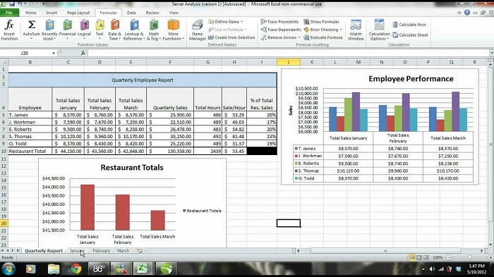
Creating a report to display quarterly sales in Excel can be a great way to keep track of your business’s sales performance. With the right data and some simple formulas, you can easily create a report that will provide insight into your sales trends and give you direction on where to focus your efforts. This guide will show you how to create a report to display quarterly sales in Excel, including how to set up the data and create the report.
Step-by-Step Guide to Creating a Quarterly Sales Report in Excel
1. Open a New Workbook
Open a new blank workbook in Microsoft Excel.
2. Enter the Sales Data
Enter the sales data into the workbook. This should include the sales figures for the current quarter, as well as the previous three quarters.
3. Add Labels
Label the columns with the appropriate headings, such as “Quarter”, “Sales”, and “Comparison”.
4. Create a Chart
Create a chart to visualize the data in the workbook. This can be done by selecting the data and then clicking the “Insert” tab from the menu bar. Select the type of chart you would like to use, such as a line chart or bar chart.
5. Add a Trendline
Add a trendline to the chart to show the overall sales trend over the four quarters. To do this, right-click on the chart and select “Add Trendline” from the menu.
6. Format the Chart
Format the chart to make it more visually appealing. This can be done by selecting the chart and then clicking the “Format” tab from the menu bar. Here you can change the color of the chart, adjust the font size, and more.
7. Add a Summary Table
Add a summary table to the report to illustrate the overall performance of the sales over the four quarters. This table should include the total sales for each quarter, as well as the percentage change from the previous quarter.
8. Export the Report
Export the report to a file format such as PDF, Word, or Excel. This will make it easier to share the report with others.
9. Share the Report
Share the report with stakeholders or other interested parties. This can be done via email, or by uploading the report to a cloud storage service such as Dropbox or Google Drive.
Utilizing Excel Formulas to Automatically Generate Quarterly Sales Reports
Generating reports is an essential part of modern business operations and one of the most common reports requested by management is the quarterly sales report. With the power of Microsoft Excel, creating this report is now easier than ever before. By utilizing Excel formulas, users can easily create a quarterly sales report that provides valuable information to management in a timely and efficient manner. To begin, users should create a spreadsheet with columns that contain the total sales for each quarter. The first column should include the total sales for the current quarter, and subsequent columns should include the data for the prior three quarters. Next, users should create a row for each individual salesperson.
The first cell in the row should include the individual’s name, and the subsequent cells in the row should include the quarterly sales figures for that individual. Once the data is input, the user can begin to use Excel formulas to calculate the total sales for each quarter. For example, to calculate the total sales for the current quarter, users can simply use the SUM function. This function will add up all of the sales figures for the current quarter and output the result in the corresponding cell. Users can also use the AVERAGE function to calculate the average sales for each quarter. This function will divide the total sales figure for each quarter by the number of salespeople, providing a more detailed look at the performance of the sales team.
Once the total sales and average sales figures are calculated, users can then use the COUNTIF function to determine the number of salespeople who achieved a certain target. This is especially useful for tracking the performance of individual salespeople, as users can specify a certain sales target and the function will output the number of people who achieved that target. By utilizing Excel formulas, users can quickly and easily generate quarterly sales reports that provide valuable insights into the performance of the sales team. This process is both time-efficient and cost-effective, making it a great choice for businesses who need to deliver reports quickly and accurately.
How to Visualize Your Quarterly Sales Reports with Pivot Tables
Introduction For many businesses, sales reports are an essential part of tracking and monitoring performance. However, it can be difficult to make sense of large amounts of data. Thankfully, pivot tables provide an easy way to visualize your quarterly sales reports. With pivot tables, you can quickly and easily analyze your data to gain insights into your sales performance. In this article, we will discuss how to use pivot tables to visualize your quarterly sales reports. What is a Pivot Table? A pivot table is an interactive tool that allows you to quickly summarize and analyze large amounts of data. Pivot tables can help you easily identify trends, make comparisons, and analyze complex data sets. They are particularly helpful for summarizing quarterly sales data.
How to Create a Pivot Table Creating a pivot table is a straightforward process. First, select the data you want to include in your pivot table. Then, select the “Insert” tab and click on “Pivot Table.” You will then be prompted to select the data range you want to include in your pivot table. After selecting the data range, you will be presented with a blank pivot table. Next, you will need to add fields to your pivot table. To do this, select the fields you want to include in your table from the “Choose fields to add to report” section. For example, you may want to include fields such as “product name,” “quarter,” and “sales.”
You can then add additional fields, such as “category” or “region,” if you want to further analyze your data. Once you have added all the necessary fields, you can start to customize your table. You can do this by adding filters, sorting, and grouping fields. You can also change the layout of your table and add additional calculations to further analyze your data. Conclusion Pivot tables provide an easy way to visualize your quarterly sales reports. They allow you to quickly summarize and analyze large amounts of data, helping you to identify trends and gain insights into your sales performance. With a few simple steps, you can create a powerful and informative pivot table to help you better understand your sales data.
Leveraging Excel Charts to Display Quarterly Sales Trends
Excel charts are a powerful tool for visualizing data and can be used to illustrate quarterly sales trends. By leveraging the charting features in Excel, businesses can quickly and easily analyze their sales data to better understand their performance over time. When creating a chart to display quarterly sales trends, the first step is to prepare the data in a spreadsheet. This includes entering all relevant sales information into the spreadsheet, including the sales figures for each quarter. Once the data is entered, it can be graphed using one of Excel’s many chart types.
The most common type of chart used to display quarterly sales trends is a line chart. This type of chart is ideal for showing changes in sales over time. To create a line chart, select the data and go to the Insert tab. Then, select the Line chart option, which will create a chart of the data. Once the chart is created, the axes can be modified to better reflect the sales data. The horizontal axis will usually display the quarters, while the vertical axis will display the sales figures. Labels can be added to the axes to further clarify the data. Finally, the chart can be customized by changing the colors and adding a title.
This will help to make the chart more visually appealing and easier to interpret. With these steps, a line chart of quarterly sales trends can be quickly and easily created in Excel. By leveraging the power of Excel charts, businesses can quickly and easily analyze their quarterly sales data. This can help them to better understand their performance over time and make more informed decisions about their sales strategies.
Using Excel Filters and Conditional Formatting to Analyze Quarterly Sales Data
Analyzing quarterly sales data is a valuable process for businesses, providing insight into current and future performance. Excel offers a range of tools to help make the analysis process easier, including filters and conditional formatting. Filters are a useful tool for quickly finding and sorting data. With an Excel filter, you can select only the data you need to analyze. For example, you can use a filter to show only the sales data from a particular quarter. To apply a filter, select the relevant cells and then click the “Data” tab. Then, select “Filter” from the sort and filter group.
A drop-down arrow will appear in each column header, allowing you to choose which data to display. Conditional formatting is also useful for analyzing quarterly sales data. This feature allows you to apply certain formatting rules to cells based on their contents. For example, you could use conditional formatting to highlight cells containing sales figures that are higher or lower than a certain threshold. To apply conditional formatting, select the relevant cells and then click the “Home” tab.
Then, select “Conditional Formatting” from the styles group. You can then choose from a range of options to apply the desired formatting rules. Using Excel’s filters and conditional formatting tools can make it easier to quickly and accurately analyze quarterly sales data. With these features, you can quickly identify trends and patterns in your sales figures, allowing you to make informed decisions about your business.
Quick Summary!
Creating a report to display quarterly sales in Excel is a simple task that requires basic knowledge of formulas and functions. With the right formulas and functions, it is possible to create a visually appealing report that can be used to analyze trends and identify opportunities for improvement. Furthermore, by leveraging the power of Pivot Tables and Charts, it is possible to create even more detailed and useful reports. With the right data and a few clicks, creating a report to display quarterly sales in Excel is an easy task.